

Tecton AI
Company: Tecton.ai
My role: Freelance UI Designer
Project type: 0-1
Device: Web
Audience: B2B
Timeframe: Spring - Summer 2019
Company Overview
Tecton is an advanced Feature Platform designed to revolutionize the data lifecycle for machine learning. It simplifies and accelerates the journey from raw data to actionable features, helping organizations deploy machine learning models faster and with higher performance. By abstracting the complexities of data engineering, Tecton enables data scientists to focus on building and refining models rather than managing intricate data pipelines. This streamlined approach addresses common pain points in machine learning workflows, such as data inconsistency, manual feature engineering, and integration challenges, ultimately enhancing model reliability and deployment speed.
Project overview
As a Freelance Product Designer, I partnered directly with Tecton’s founders to design an intuitive user interface for their feature management platform during its stealth phase. The goal was to create a compelling user experience that showcased Tecton’s capabilities and helped secure funding and attract early customers. Despite being in the early stages of development, Tecton needed a design that could effectively translate complex technical features into a clear and engaging interface. My role involved translating these complexities into high-fidelity mockups, working closely with the founders to ensure the design aligned with Tecton’s vision, aiming to demonstrate the platform’s value proposition and support its growth strategy.
Discover
At the start of the project, I had a limited understanding of feature engineering, machine learning, and data lifecycle management, including concepts like transforming raw data into machine learning features and their impact on model performance. To address this, I collaborated closely with Tecton’s founders to understand their platform’s intricacies and value proposition. I utilized existing user feedback and conducted secondary research to gain insights into the workflows, goals, and challenges of Tecton’s target users—data science leaders and data scientists. This approach helped me build empathy and gain a comprehensive understanding of their needs and pain points.
Define
After conducting research, I gained a better understanding of feature engineering, machine learning, and data lifecycle management. Though there was still much to learn, I acquired enough knowledge about Tecton’s target users to move forward. I distilled my findings into detailed personas, representing Data Scientists and Data Science Leaders, to clearly identify their goals, challenges, and needs.
Empathy mapping
To further deepen my understanding of user frustrations and requirements, I employed empathy mapping. This exercise helped me capture the emotional and practical aspects of the users’ experiences, ensuring a more user-centric design.
Ideate
With a clear understanding of user needs, problems, and challenges, I was ready to begin the ideation phase. This involved an iterative process where I developed wireframes and incorporated feedback from the founders. Throughout this phase, I deepened my knowledge of key concepts such as feature engineering, data lifecycle management, and machine learning operations. This ongoing feedback loop and learning process led to refined wireframes that addressed user needs more effectively.
Design
In the Design phase, I transitioned to high-fidelity designs aimed at casting a vision for Tecton and assisting in securing funding. While these designs were pivotal for pitching the concept, they were not intended for immediate front-end development, as the product was still in the early stages.
Color
Tecton’s initial branding only included an orange-red logo color, and there were no other foundational styles. Given that red is often associated with errors or destructive actions, the brand color was used sparingly to avoid negative connotations. To create a positive and professional user experience, I developed additional color palettes for broader UI applications, including buttons and data visualizations.
Spectral color palette
I created a spectral color scale using the Material Design color tool. These colors were designated for utility purposes (such as success messages or warnings) and data visualizations. The brand color was reserved for the logo and top bar, ensuring that the UI did not appear error-prone or negative. This approach also made the UI more visually appealing, aligning with the founders’ vision of a bold, modern, and attention-grabbing design.

Neutral color palette
Additionally, I developed a neutral color scale with a purply dark blue base. Research supports that combining cooler tones with warmer ones creates a balanced and professional look. This neutral palette balanced the warmer tones of the brand color, ensuring a visually harmonious and sophisticated interface.

Final color palette
Description: With the spectral and neutral color scales established, I focused on defining the specific colors for various UI elements to ensure consistency across the experience. I selected colors for typography, surfaces, strokes, utility elements, and data visualizations. Additionally, I kept accessibility at the forefront of my design decisions, ensuring that all elements met contrast accessibility requirements—4.5:1 for text and 3:1 for interactive elements—to guarantee readability and usability for all users.
Typography

Surfaces

Utility

Data visualizations

Ensuring accessibility compliance
I kept accessibility top of mind when defining the final color palette. Adhering to WCAG (Web Content Accessibility Guidelines) standards, I ensured all text elements met a contrast ratio of 4.5:1 against their background colors, as outlined in SC 1.4.3. This ratio ensures readability for users with visual impairments. I maintained a minimum contrast ratio of 3:1 for interactive elements like buttons and inputs, as recommended in SC 1.4.11. By prioritizing these accessibility standards, I aimed to create a color palette that is both visually appealing and inclusive, ensuring that all users can interact with and benefit from the design effectively.
Typography scale
I chose the Google font Poppins for its modern and clean aesthetic, ideal for a data-intensive UI. A typography scale was created using the major third numerical scale, with 16 pixels as the base font size. This approach ensured a clear visual hierarchy, which is crucial for effectively managing and presenting large amounts of data.
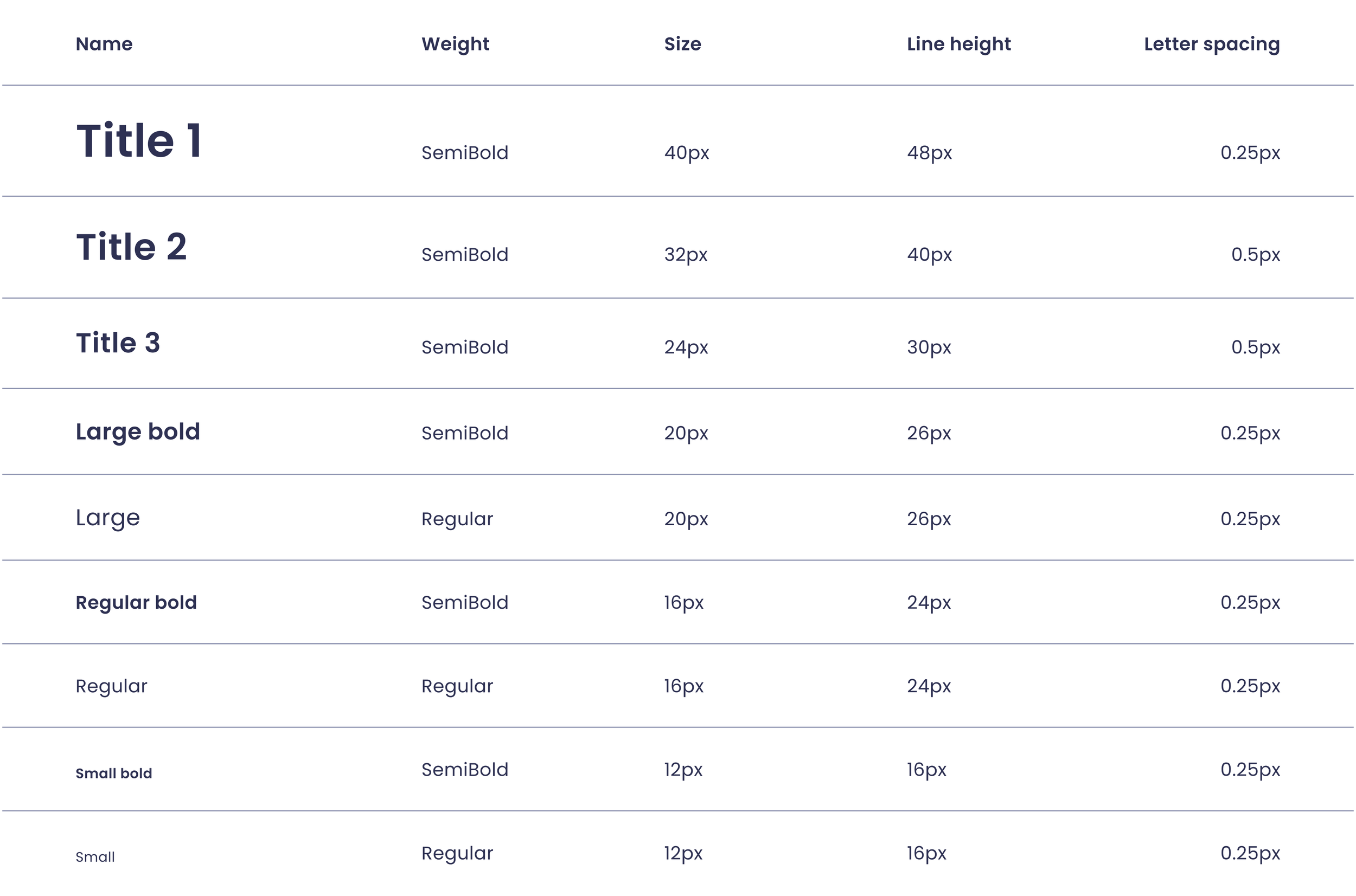
Ensuring accessible typography
I kept accessibility top of mind when defining our typography scale. Although WCAG (Web Content Accessibility Guidelines) does not specify font sizes, the Bureau of Internet Accessibility recommends a minimum font size of 16 pixels for body text to enhance readability. Accordingly, I set our base font size for body text to 16 pixels and ensured that our smallest text, used for captions and smaller labels, was no smaller than 12 pixels. Additionally, to comply with WCAG guidelines SC 1.4.12, I ensured that the line height for body text was at least 1.5 times the font size, applying this standard to both the 16-pixel and 12-pixel text. This approach promotes readability and ensures a better user experience.
Spacing scale
The major third scale was applied to spacing, starting with 16 pixels as the base size. This method provided a consistent spatial rhythm throughout the product. I refined the spacing by removing certain increments (e.g., 20 pixels and 40 pixels) to achieve clear contrast and practical application, ensuring a balanced and harmonious layout.

Iconography
I selected a rounded, outlined style from a free icon library. This style was chosen for its visual clarity and appropriateness for presentations to investors and customers. While free icons were suitable for this stage, future iterations might include custom designs for a more tailored and refined look.

High fidelity designs
With the foundational styles and wireframes in place, I moved on to high-fidelity designs. The founders provided a list of screens they wanted to see, and I created those as well as additional screens driven by my excitement and passion for the project. The high-fidelity designs aimed to showcase the vision and functionality of the platform, serving as a tool to inspire stakeholders and guide future development. These designs were not intended for immediate front-end development but were crucial in securing funding and demonstrating the product's potential.
Streamlined feature management and analysis
The Overview Dashboard serves as the user’s homepage, offering a comprehensive analysis of feature performance and key metrics. It provides a high-level view of critical data, allowing users to quickly assess the overall status of their features while also offering detailed insights through a data table. This table helps users efficiently manage their feature portfolio by presenting actionable information at a glance. From the table, users can navigate to a Feature Details page, which delivers an in-depth analysis of individual features. This page provides granular insights with detailed metrics, charts, and summary cards, supporting effective decision-making. By enabling users to edit features, streamline data management, and export feature data, the platform enhances usability and functionality, addressing the complexities of feature engineering, machine learning, and data lifecycle management.
Overview dashboard
Features details page
Optimizing feature management and integration
The Feature Management page serves as a central hub for users to efficiently oversee and manage their features, presenting a comprehensive data table that lists all existing features for streamlined viewing, organization, and management. It addresses key challenges in feature engineering by allowing users to track and update features easily, ensuring data accuracy and relevance. Users can gain deeper insights through a comparative table with additional columns for more detailed information and perform utility and bulk actions for enhanced management. From this page, users can swiftly navigate to the feature addition modal, which simplifies the process of introducing new features into the system. The modal is designed with user-friendliness in mind, featuring intuitive forms and validations to guide users through adding and configuring new features seamlessly. The "Manage Templates" button allows users to create, edit, and apply templates for feature configuration, further streamlining the feature addition process. This holistic approach supports effective lifecycle management by ensuring smooth integration of new features and maintaining alignment with existing data. Together, these pages enhance user experience by making feature management more efficient and reducing complexity in feature engineering and machine learning operations.
Feature management page

Add feature modal
Enhancing data source management and integrations
The Data Sources page serves as the central hub for users to manage and oversee all data sources integrated into the platform, offering comprehensive visibility and control. It allows users to monitor data integration, track data accuracy, and maintain connectivity, addressing key challenges in data lifecycle management. From this page, users can navigate to specific Data Source Details pages, which provide in-depth insights into each data source, including connection details, status, data volume, and overall health. This detailed view is crucial for ensuring data accuracy and quality, enabling data scientists and managers to manage data effectively and address any issues promptly. By combining these two pages, users gain a holistic view of their data sources, enhancing their ability to manage data integration and quality, which is essential for effective feature engineering, machine learning operations, and overall data lifecycle management.
Data sources page
Data source details page
Optimizing system performance and incident management
The Operational Monitoring page is essential for maintaining the system’s health and performance by providing a comprehensive snapshot of key metrics, alerts, and performance trends. It helps users track system health, monitor performance, manage incidents and alerts, and analyze logs, ensuring smooth operation and swift issue resolution. This page is crucial for effective feature engineering and machine learning, as it allows users to optimize system resources and address operational issues that could impact data processing and model performance. Complementing this, the Incident Page centralizes incident management, offering real-time tracking, detailed documentation, and a unified view of all incident-related activities. This centralized approach enhances users' ability to resolve issues efficiently, improves communication, and supports better decision-making, ultimately contributing to operational stability and the continuous improvement of feature engineering processes and data lifecycle management.
Operational monitoring page
Incident ticket modal
Conclusion
In this case study, I gained valuable insights into the needs of users in the areas of feature engineering, machine learning, and data lifecycle management, which ignited my passion for machine learning and artificial intelligence. The comprehensive design assets I created played a crucial role in translating Tecton's vision into a tangible, visual format. These assets not only helped articulate the product’s value proposition but also served as powerful tools in securing additional funding and pitching to early customers. By addressing user challenges through intuitive interfaces and detailed insights, the designs supported the founders in demonstrating the potential of their platform, ultimately enhancing their ability to attract investors and engage potential clients effectively.