
MANTL Bank Account Opening
Company: MANTL
My role: Product Designer
Project type: 0-1 and optimization
Device: Web
Audience: B2B
Timeframe: June 2020 - March 2021
Introduction
MANTL equips banks and credit unions with tools to grow deposits and streamline operations. The Omnichannel Account Origination platform bridges the divide between digital and in-branch services, ensuring a cohesive flow of information and a unified customer experience across all banking channels.
Problem
As of April 2020, MANTL supported account openings through two primary channels: a digital self-service for consumers and an in-branch process for business accounts. This bifurcation led to operational inefficiencies and a disjointed customer experience due to the absence of:
In-branch consumer account openings.
Self-service business account openings.
This gap hindered scalability and flexibility, impacting customer satisfaction and operational efficiency.

Solution
The initiative aimed to expand our platform by introducing missing channels and refining existing ones to create seamless interfaces for all account opening facets. As the lead designer for in-branch experiences, my role extended beyond introducing a new consumer channel; it involved a significant redesign of the existing business channel. This ensured consistent user experiences across both channels and alignment with the insights uncovered during our research, thereby enhancing the overall effectiveness and cohesion of the platform.
A completed business application
A completed consumer application
My design process
As lead designer of the Console Account Opening team, I am responsible for the entire design process (from discovery to production) of the two in-branch channels, in-branch business account opening (existing quadrant), and in-branch consumer account opening (new quadrant). I work closely with the designer responsible for the two self-service quadrants to ensure that we are solving problems in uniform ways and enhancing the customer experience across channels.

Discover
Under ideal conditions, the discovery phase would commence with extensive user research to directly inform our design decisions. However, due to a shift in our design leadership structure, the resources typically allocated for this crucial activity were unavailable. This limitation necessitated a creative approach to gathering insights and understanding user needs.
Research
Despite constraints on direct user engagement due to shifts in our design leadership structure, I remained committed to grounding my design decisions in data. I creatively navigated these limitations by utilizing our existing research archives, gathering user feedback from our Customer Success team, and conducting secondary online research to identify industry trends. These efforts provided a comprehensive insight into user needs and pain points, which are summarized below.
Personas
Upon synthesizing my research findings, I created two personas to represent our main user groups: the Bank Administrator, who manages account openings, and the BSA Officer, who reviews and approves or rejects applications. These personas were pivotal in guiding design decisions, ensuring solutions were tailored to address the specific challenges and workflows of each role.
Define
Following the discovery phase, I translated the insights gathered into detailed user flows, mapping out the essential tasks for the account opening and review processes. I developed two distinct user flows: one for in-branch business account openings and another for in-branch consumer account openings. I collaborated closely with our product and engineering teams to align the flows with both user needs and system capabilities. Through several iterations and continuous stakeholder feedback, I refined these user flows to ensure they were both effective and technically feasible.
In-branch business account opening user flow
In-console consumer account opening user flow
Existing information architecture
As MANTL’s in-branch products expanded, the information architecture began to show signs of strain, particularly in the areas of findability and scalability. The complexity increased with the addition of new features, which were not integrated into a scalable structure from the outset.
Findability challenges
Our platform's navigation primarily used a left drawer that stored fixed queues of filtered searches—like saved views rather than flexible, dynamic filters. This design lacked logical grouping and prioritization, making it difficult for users to find specific entities like applications or businesses. Users could only search businesses by tax ID or core ID numbers, which are not readily available, severely limiting the utility of the search function. No direct search functionality was provided for applications, forcing users to navigate through cumbersome lists organized only by last update—a method that does not support efficient or relevant retrieval of information.
This rigid structure failed to follow usability best practices, which advocate for intuitive search and filter capabilities directly above data tables. Such capabilities allow users to seamlessly refine their searches with multiple filters, adapting to their immediate needs. Instead, our users, including bank admins and BSA officers, had to manually sift through extensive lists to locate the necessary information, a process that was both time-consuming and error-prone. The lack of intuitive navigation and flexible search options not only hindered the user experience but also impacted the efficiency with which users could perform their roles, ultimately leading to frustration and decreased productivity.
Scalability challenges
Our platform's scalability was compromised as additional features led to overloaded pages, resulting in inefficient scrolling and difficulties in handling large data sets. The outdated design featured poor visual hierarchy and excessive white space, which compounded navigation and data retrieval issues. This inefficiency was particularly evident in the inconsistent display of related entities; for instance, individuals associated with applications were not visible on corresponding business profiles, creating confusion and operational delays.
To address these issues, we recognized the need for a design overhaul that improved visual hierarchy and effectively utilized screen space. A more coherent and scalable design would simplify user interactions by making critical information easy to find and interact with, thereby enhancing the overall user experience and reducing the cognitive load on our users, including bank admins and BSA officers.
Information architecture redesign
Due to resource constraints, I wasn’t able to facilitate an external open card sorting exercise, so I led an internal open card sort with our design and customer success teams to reevaluate our in-branch product's information architecture. I created cards for every element that needed to be included in the in-branch product, and each participant grouped these cards into categories that seemed most logical to them. They also created labels for each grouping. This process helped align my thinking with potential user perspectives. The result was a streamlined structure organized into four main categories, which I then visually connected in a diagram to represent their logical flows and relationships.
Entity relationship exploration
Since this initiative was set to expand our in-branch product's capabilities to include consumer applications, it added complexity by introducing person profiles alongside business profiles. I wanted to delve deeper into how businesses, people, and accounts related to each other and I was able to categorize applications into main groupings, those initiated from a customer (like business and consumer account applications) and those initiated from existing accounts (such as adding beneficiaries or authorized signers). So I mapped out these application groups and how the different entities related to each application type. I did this to better understand how to design a system that could flexibly handle both new account creations and modifications to existing accounts, ensuring our platform could intuitively support the increased complexity.
Sitemap
Based on the insights and exercises I conducted so far in my design process, I developed a sitemap that enhanced navigation and accessibility within our in-branch product. Recognizing the need for easy access to various application types, I established "applications" as a top-level navigation item. This reorganization created a centralized location for BSA officers to efficiently review and process applications, serving as their primary access point.
In addition to the applications tab, I introduced "businesses" and "consumers" as the other top-level navigation items to meet the needs of bank admins. This configuration allowed bank admins to quickly locate and continue working on existing customer applications or initiate new ones for their customers. Under each tab, I included the sub-items identified during the card sorting exercise, hoping to improve findability and reduce the navigation issues previously identified. The goal of this new sitemap was to ensure that users could find necessary information more efficiently.
Searching & filtering
The initial system restricted business searches to tax ID or core ID numbers, information often unavailable to users, and lacked flexible filtering options for applications, making it difficult to locate specific entities or applications. To overhaul this, I defined the needs of our users through 18 job stories, identifying whether searching, filtering, or both were required for each scenario. This comprehensive analysis helped redesign the search and filter functionalities to support tasks like finding businesses by name or sorting applications by status, significantly enhancing the user experience by providing users with both flexibility and control.
Ideate
With the in-branch product’s structure and content grouping clearly defined, I transitioned into ideation. Stakeholders were keenly involved throughout this process, providing crucial feedback as I diverged in exploring various design possibilities and then converged to refine and select the most promising solutions. This iterative cycle of rapid ideation and feedback was essential for developing effective design solutions that met both user needs and business goals.
New page headers and navigation
Research indicated that users experienced cognitive overload and difficulty locating necessary information to complete tasks, often resorting to paper forms and manual processes instead of using MANTL. The existing left navigation drawer, filled with saved searches, failed to empower users with intuitive navigation, exacerbating the issue. To address this, I explored several navigation structures aimed at reducing cognitive load and simplifying user flow:
Initially, I revisited the left drawer design, organizing it with three main items: applications, businesses, and consumers, with additional options like settings and support at the bottom.
Pros: Familiar layout; direct access to main areas from any page.
Cons: Consumes significant screen space; limited justification for its use given only three primary items, potentially underutilizing the available space.
I implemented a top navigation bar featuring applications, businesses, and consumers. This design included profile access and notifications, with other non-branch product areas tucked away in an overflow menu.
Pros: More screen space for content; sleek and modern appearance.
Cons: Important product areas hidden in overflow menu, reducing discoverability and potentially increasing the number of clicks to access these areas.
Based on stakeholder feedback emphasizing the need for seamless navigation between in-branch and self-service channels, I integrated a left navigation bar for easy toggling between different product modes, alongside a top bar.
Pros: Enhances discoverability of both main and ancillary product areas; supports user familiarity and ease of transition between different modes.
The third option emerged as the superior solution due to its balanced approach to accessibility and functionality. It adeptly supported users in navigating the complexities of the platform while accommodating their need for a seamless experience across different service modes, effectively addressing the initial issues of cognitive overload and navigation challenges.
Defining application competition
To enhance the usability of MANTL's application processes and deter users from resorting to paper-based methods, I explored several design patterns to make digital applications as intuitive and efficient as possible. Each design iteration aimed to improve upon the last, addressing the concerns revealed in our user research where bank admins preferred paper applications.
Initially, I explored using a modal window for each section of the application, such as the "business overview."
Pros: Keeps the user focused on one task at a time without overwhelming them with the entire form; can reduce cognitive load by segmenting the process.
Cons: Interrupts the flow of work as users must open and close modals repeatedly; can create frustration if users need to reference information from another section, as switching between modals is cumbersome.
Next, I explored a full-page form that included all sections with a progress bar at the bottom.
Pros: Provides a holistic view of the application, allowing users to see the entire form at once; the progress bar helps users track their completion status.
Cons: While it informs users of their progress, it doesn't allow them to easily navigate between sections. Users might feel lost without clear labels, leading to potential errors or overlooked sections.
Finally, I explored a wizard-style interface that combined the full-page view with a top navigation bar labeling each section.
Pros: Offers clear guidance on the form's structure and progress, making it easy for users to jump between sections without losing context.
The wizard approach emerged as the superior design solution by effectively combining a full-page view with a clearly labeled top navigation bar, facilitating easy toggling between sections. This design adheres to the Gestalt principles of continuity and closure, allowing users to understand both the part and the whole of the application process simultaneously. It significantly reduces cognitive burden by providing a predictable and controllable environment. This approach addresses the user's need for clarity and ease found in paper applications while offering the efficiency and integrated benefits of a digital solution.
Design
After refining the low-fidelity designs through several rounds of feedback, I transitioned into the design phase. Recognizing the previous issues with a poor visual hierarchy that made pages difficult to scan and navigate, I first prioritized revisiting our foundational styles before jumping into high-fidelity designs.
Typography scale
To create a clear and effective typography scale, I adopted the numerical scale, major third, to help define our different type sizes. This choice was strategic; the major third scale offers a balanced progression of type sizes, which naturally enhances readability and creates a strong visual hierarchy, essential for our text-heavy interface. This scale includes six type sizes within 10 distinct styles, providing a versatile range that can accommodate various UI elements from headlines to body text. I selected Open Sans as the new typeface for its open and friendly letterforms that are highly legible at both large and small sizes. The combination of a methodical scale and a clear, sans-serif typeface like Open Sans ensures that content is accessible and scannable, reducing cognitive load for users.
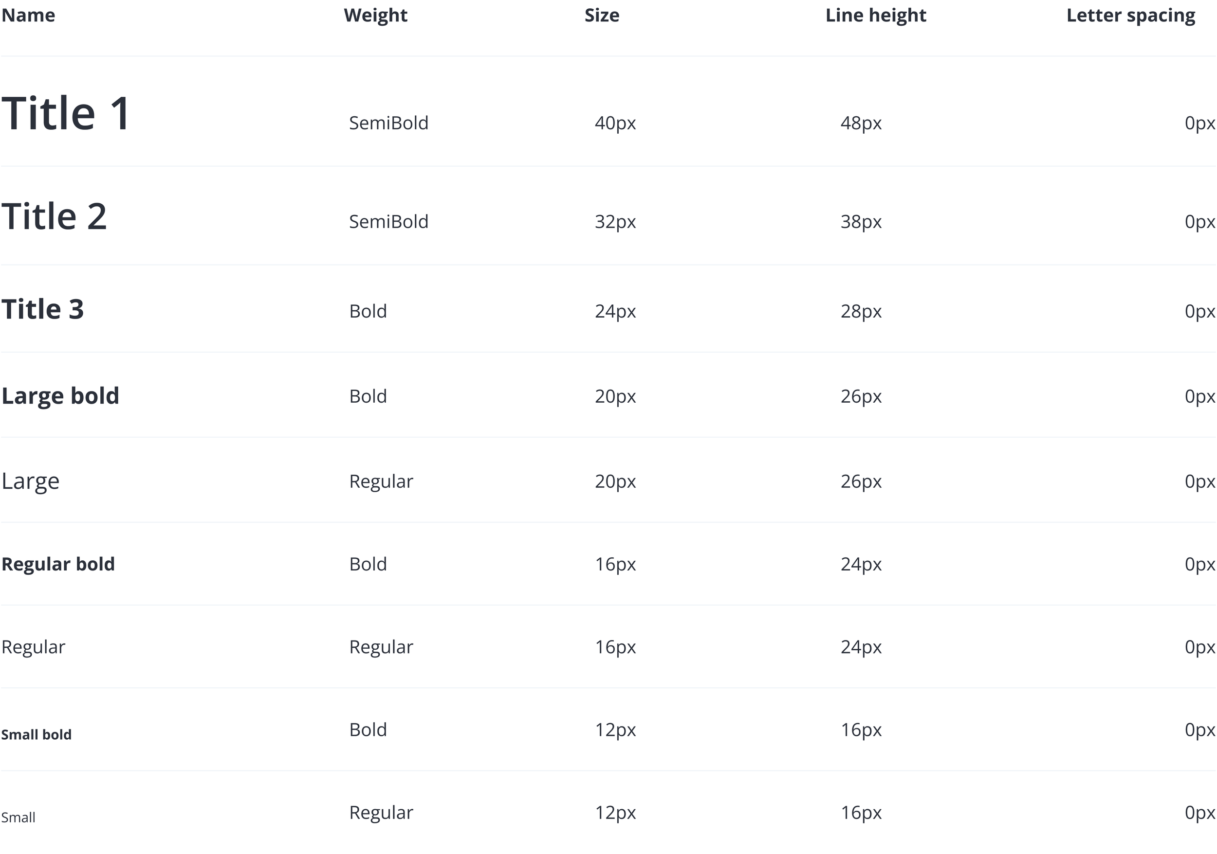
Ensuring accessible typography
I kept accessibility top of mind when defining our typography scale. Although WCAG (Web Content Accessibility Guidelines) does not specify font sizes, the Bureau of Internet Accessibility recommends a minimum font size of 16 pixels for body text to enhance readability. Accordingly, I set our base font size for body text to 16 pixels and ensured that our smallest text, used for captions and smaller labels, was no smaller than 12 pixels. Additionally, to comply with WCAG guidelines SC 1.4.12, I ensured that the line height for body text was at least 1.5 times the font size, applying this standard to both the 16-pixel and 12-pixel text. This approach promotes readability and ensures a better user experience.
Spatial scale
To enhance visual cohesion across our platform, I implemented the same major third numerical scale used in our typography for our spatial scale, promoting a harmonious spatial rhythm that aligns with our textual elements. This scale offers a progressive sequence ideal for various UI spacing needs, from margins to smaller UI elements. Tokenizing these values standardized implementation for developers, addressing previous inconsistencies that frequently led to UI review failures. This standardized approach not only streamlined workflows but also maintained design integrity throughout development, improving efficiency and ensuring a polished, user-friendly product.

High-fidelity designs
With our typography and spatial scales well-defined, I confidently transitioned into high-fidelity designs. This stage allowed for the detailed refinement of key user flows and interface elements. The focus was to enhance functionality and aesthetic coherence, ensuring that each aspect of the interface would meet user needs while adhering to established design principles
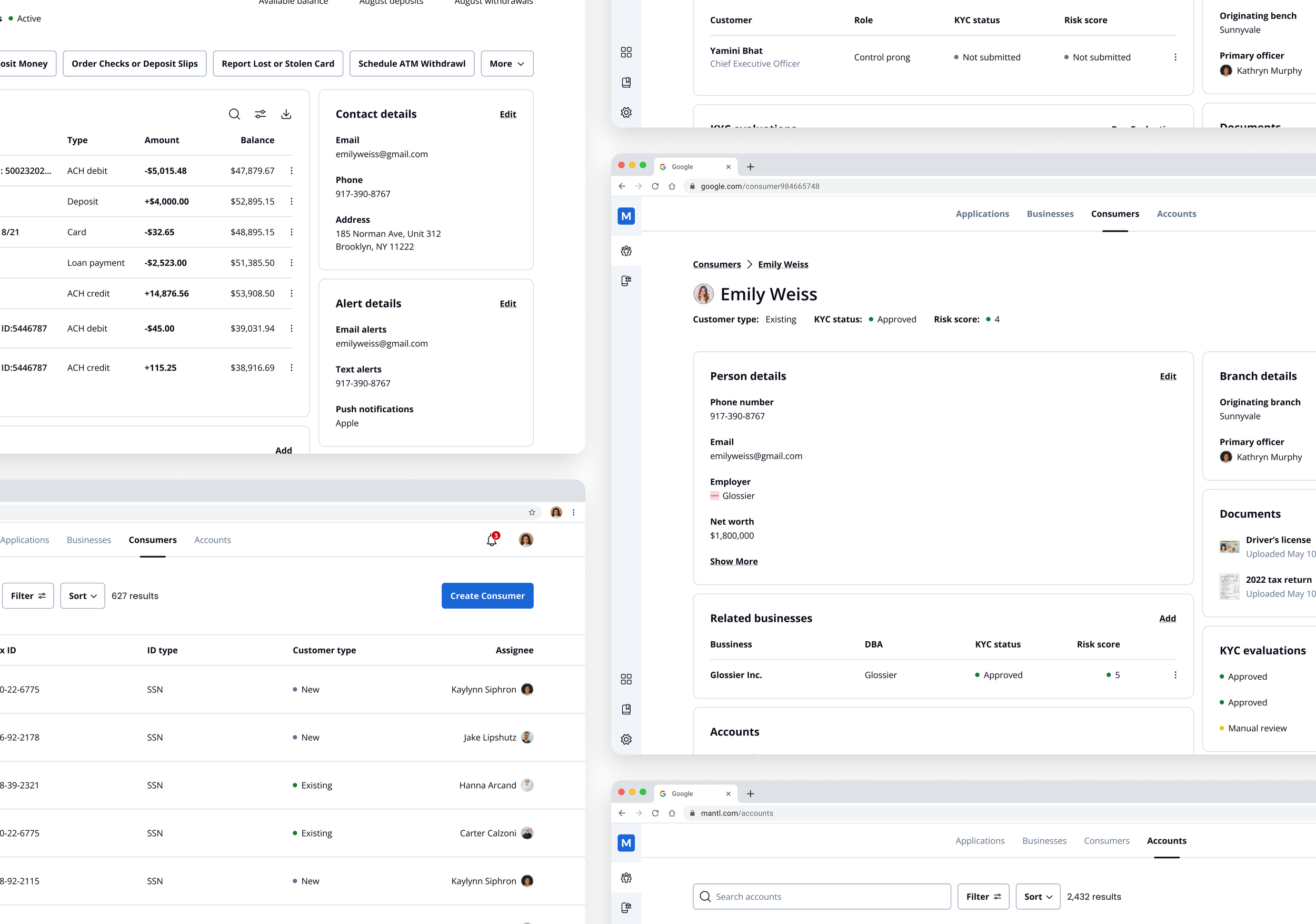
New and improved entity pages
With the introduction of in-branch consumer banking account openings, a comprehensive redesign of the entity pages was essential. This expansion necessitated the creation of new consumer pages, allowing bank admins to view and manage consumer information directly from the application interface. Alongside this, we seized the opportunity to update the business pages, which were already undergoing redesigns to align with the new application processes.
This update wasn't just limited to consumer and business pages; we also developed new account pages. These pages become active once an application is approved and the account is officially booked in the core system. The initial version of these account pages provides a foundational interface for bank admins to begin managing these accounts, setting the stage for future enhancements that will introduce more in-depth functionalities.
Application Page: Showcases the redesigned application interface with enhanced navigation and accessibility features.
Business Page: Highlights the updated business page layout, which now integrates more detailed information and direct access to related applications, accounts, and profiles.
Consumer Page: Displays the new consumer page, specifically designed to streamline the management of consumer information and account settings within the branch setting.
Account Page: Provides a preview of the booked account page where bank admins can start to engage with the account, offering basic management tools in this initial release.
Improved searching and filtering
A pivotal area of high-fidelity designs was the enhancements made to the search and filtering mechanisms for our key top-level navigation items: applications, businesses, and consumers. Initially, the platform restricted users to searching for businesses using fixed criteria such as core ID or tax ID, without the ability to filter results. Applications were similarly constrained; users could not search for specific applications nor apply filters, instead relying on predefined filtered searches accessed via the left navigation bar. This setup was not only non-intuitive but also violated the Gestalt principle of proximity by disconnecting the navigation actions from the changes they would make to the data table.
To address these issues, I implemented a more traditional UX pattern, positioning search and filter options directly above the data table for applications, businesses, and consumers. This change not only aligns with the Gestalt principle by clearly associating these controls with the data they affect but also significantly enhances functionality.
Applications: Users can now perform searches by application name, customer name, or application ID, and apply multiple filters to refine their view.
Businesses: The search functionality was expanded to include name searches alongside core and tax ID options, with added capabilities to filter results based on various criteria.
Consumers: Mirroring the enhancements made for businesses, consumer profiles received the same flexible search and filtering capabilities
Accounts: Users can now perform searches by account name, customer name, or account number, and apply multiple filters to refine their view.
New feature: Open tasks
One of the significant challenges uncovered during research was the complexity bank admins faced in ensuring that all necessary information was collected and completed. To manage this, users resorted to personal checklists and paper forms to track required actions. To solve these inefficiencies, I introduced the "open tasks" feature. This enhancement provides a clear, intuitive path for completing applications. I also added an “incomplete” chip to each section of the application that was missing the required information. Incorporating these additions to the application supports the usability heuristic of “visibility of system status,” keeping users well-informed of pending actions, reducing cognitive load, and enhancing navigational efficiency.
Application page: Shows an “open tasks” floating action button and an "Incomplete" chip indicating unfinished sections, offering users immediate visual cues on what needs attention.
Open tasks menu: Displays the open tasks menu that appears when the floating action button is clicked, listing sections that require completion, allowing users to select and navigate directly to the area.
Application navigation: Users are taken directly to the section of the application form that they accessed either through the open tasks menu or from the section they clicked on the application page.
Send to customer
A key challenge identified through research was the extensive email correspondence required between bank admins and customers during the account opening process. This was largely due to the complex nature of business account requirements, which include collecting detailed information on the business, control prongs (individuals with significant control over the business), and owners holding 25% or more equity. This often led to fragmented exchanges with customers who typically didn't have all the necessary details (like Social Security numbers or home addresses of related parties) during initial meetings. To address these inefficiencies and improve customer experience, I introduced the "Send to Customer" feature. Allowing bank admins to send a secure link via email directly to customers, enabling them to input missing information into a self-service style application form. It facilitates an easy, integrated way for customers to complete their part of the application process online, significantly reducing the need for back-and-forth communication. This solution is especially crucial for business accounts due to their complex information requirements but is also available for consumer accounts, where the need may arise less frequently.
Application page: The 'Send to Customer' button is strategically placed next to the 'Submit Application' button at the top of the page. This positioning clearly conveys to users that both actions are applicable to the entire application.
Confirmation modal: After clicking 'Send to Customer', users are presented with a modal to confirm their action. They can select the recipient related to the business and add a custom message, enhancing clarity and personalization. This step respects the heuristic of 'user control and freedom', allowing users to review and confirm their actions before finalizing them.
Success toast: Upon sending, a toast notification confirms the successful transmission and includes an 'Undo Send' option. This feature supports the heuristic of 'error prevention' and 'user control and freedom', offering users a chance to retract the action immediately if made in error, ensuring flexibility and reducing potential stress or confusion.
Validate
To ensure my design decisions effectively addressed user needs, I obtained approval from senior leadership to conduct usability testing. I partnered with the Director of Design to conduct usability testing with bank admins from four different customer banks via Zoom. Participants navigated the account opening process using a clickable prototype and spoke out loud so that we could collect real-time feedback. At the end of the study, we asked a few pre-defined questions and any follow-up questions we had regarding the feedback they provided while navigating the prototype.
Positive feedback:
Efficiency gains: Bank admins noted that the redesigned process could potentially cut the time required to complete applications by half or more, significantly speeding up their workflow.
Enhanced task visibility: The clarity in displaying required actions was particularly appreciated, with the new features making it easier to track and manage remaining tasks.
Send-to-customer feature: This feature received high praise for its potential to greatly improve the customer experience by simplifying how information is collected.
UI enhancements: Participants felt that the interface improvements could reduce or eliminate the need for paper forms and manual checklists, streamlining the entire process.
Constructive feedback:
Adding authorized signers: Initially, we assumed that allowing the addition of authorized signers after opening accounts would expedite the application process. However, feedback indicated that this created redundant work for BSA officers, as they needed to review the same information multiple times. This insight was crucial and highlighted a preference for the option of incorporating details about authorized signers during the initial application process to streamline operations. This pertained to both business and consumer accounts.
Next steps
This round of usability testing not only validated our design improvements but also illuminated the path for further refinements, ensuring our platform not only meets but exceeds user expectations and operational needs.
Iterate on the authorized signer process: We will revise the application process to enable adding authorized signers during the initial submission for business accounts and similarly adjust consumer applications to allow the addition of secondary users.
Expand usability testing: Before rolling out these changes, particularly the revised authorized signer process, it is crucial to complete them and then extend usability testing to include BSA officers. This will ensure that the review process is also optimized based on their specific feedback and requirements.
Continued enhancement and testing: Ongoing refinements of UI elements and features will continue, guided by user feedback and testing results.